Progress tracking has a fundamental problem: it combines two different kinds of work. There’s work where you know what to do and just need to do it. And there’s work where you’re still figuring out what “done” even looks like. Percentage complete treats these as interchangeable. They aren’t.
I watched a migration project sit at “70% complete” for two months. The remaining 30% contained all the uncertainty nobody had resolved yet. The number was accurate in some narrow sense, but it told you nothing about whether the project was on track.
Hill Charts fix this by making the distinction explicit. The left side is “figuring it out”. The right side is “making it happen”. A task’s position tells you what kind of work remains, not just how much.
How Hill Charts Work
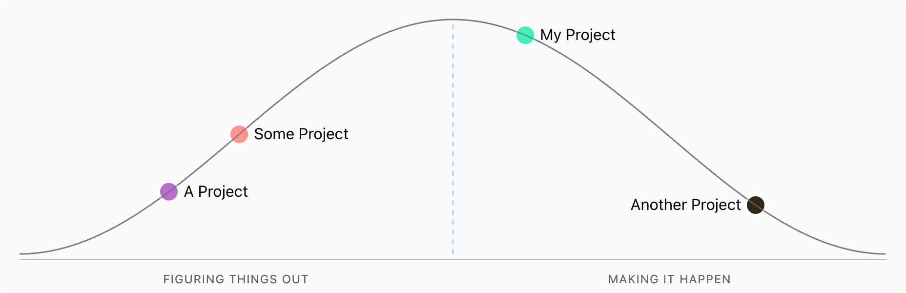
The left side of the hill is the uphill phase: research, spikes, uncertainty. You’re still learning what the work actually involves. The right side is downhill: execution. You know what to build, you just need to build it.
The peak is the turning point. You’ve answered enough questions to proceed confidently. Moving a task past the peak means “we know what to do now”.
This distinction matters because stuck work looks different on each side. A task stuck on the uphill needs more investigation or a different approach. A task stuck on the downhill has a blocking dependency or resource problem. The response is different, and the chart makes that visible.
The Subjectivity Problem
Hill Charts rely on self-assessment. One person’s “almost at the peak” is another’s “barely started climbing”. I’ve seen tasks teleport backwards when someone new looked at them with fresh eyes.
Regular check-ins help calibrate. The team needs a shared understanding of what “past the peak” means for their context. Without this, the chart becomes another form of false precision.
Where They Work Best
I’ve found Hill Charts most useful in two situations:
Communicating with senior stakeholders. Executives understand “we’re still figuring out the approach” versus “we know what to do; it’s just taking time”. A percentage doesn’t convey that distinction.
Spotting stuck work early. When a task hasn’t moved in two weeks, the chart makes it obvious. More importantly, its position tells you what kind of stuck it is.
Published on .